Exploring the Meaning of the 20th Anniversary Logo
In celebration of its 20th year, Torex has created a commemorative logo that embodies 20 years of joy and appreciation while also expressing the commitment to a future of being "Powerfully Small!"

The Three Colors of the”0”
The zero in "20", represented by a perfect circle similar to the "O" in "TOREX", boasts three different colors.
[Blue] Symbolizing Technology and the Future
The future of power ICs, supported by Torex's many years of accumulated analog technology, is represented by a seemingly advancing blue element.
[Green] Symbolizing Society and the Environment
The green element represents the realization of a plentiful society and the preservation of the global environment, as per Torex's corporate philosophy.
[Orange] Symbolizing Trust and Quality
The orange element, stemming from the visualization of high-quality products backed by Torex technology, represents trust and peace of mind.
The Logo's Laurel
The laurel, representing such ideas as "honor", "glory", and a "bright future", is not tied into a wreath shape, and is thus incomplete. This arrangement results in an expanding feel, as if opening the door to further development aspirations.
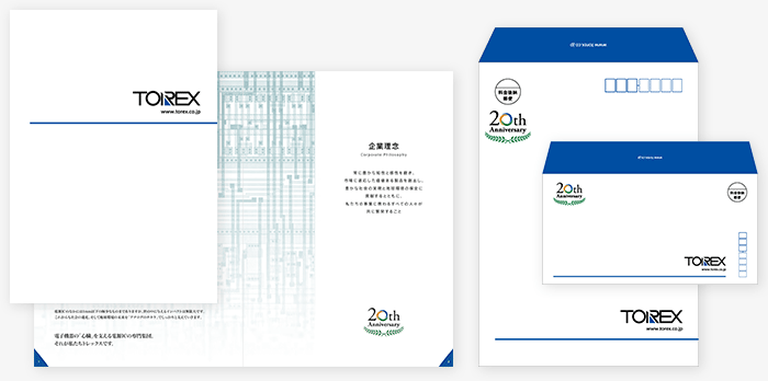 We have made the new corporate brochures and envelopes of 20th anniversary.